

We have developed a convenient and flexible system for publishing financial sector news. The objective of the project is to explain complex financial issues for small and medium-sized businesses in a clear, open way.
We analysed the main sources of user traffic on the current website, united them with the marketing plans of the company, and created a general set of user scenarios for the users visiting the corporate website.
Artile first
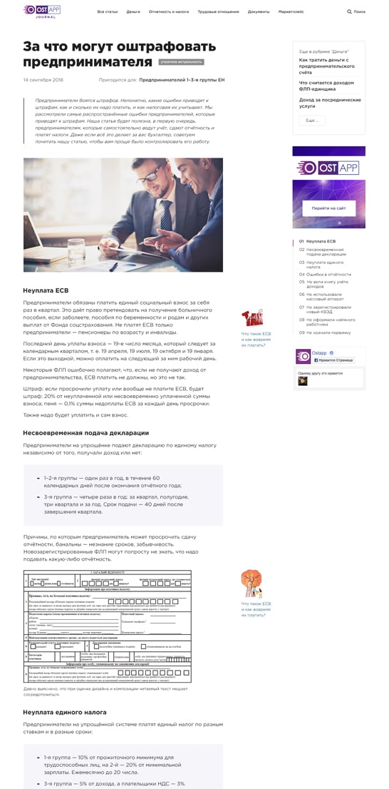
One article page is the base of the interface as the main point of entry.
Mobile first
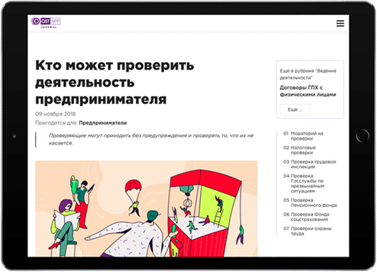
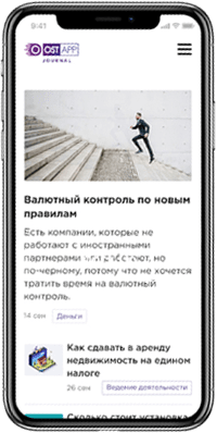
Over 80% of users visit the website from mobile devices
Human friendly view
We pay attention to the details that simplify the perception of information.
One article is the main source of the traffic and is the page most visited by the users. This is why we have worked on the display of information at article pages and started our project work with them.
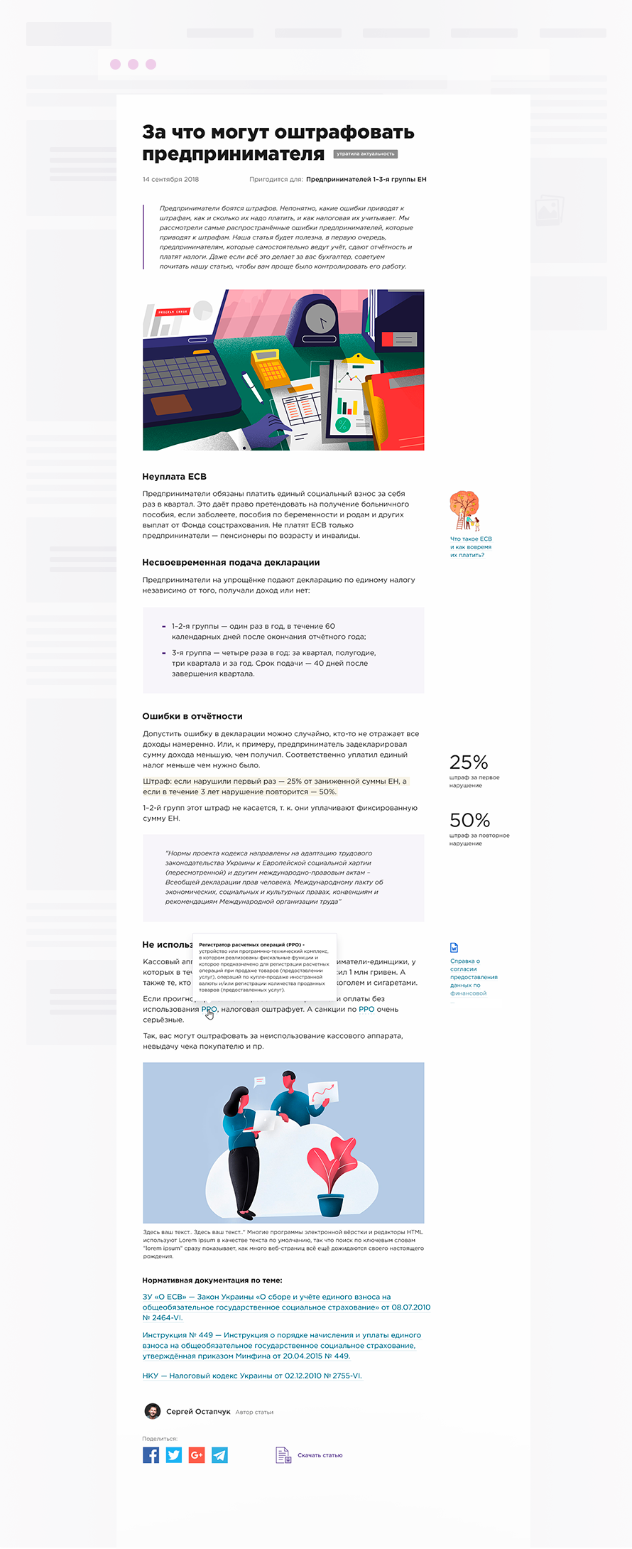
To simplify the interaction with a large amount of content, we have developed the hints/links/references
and added article navigation to its table of contents
Design is built according to a well-structured grid and can be adjusted for all devices. We strove for making the platform as clear and convenient as possible. To achieve that, we used large headlines and readable font sizes. We got rid of everything unnecessary and highlighted all key elements in colour.
The grid is using 8рх ratio
#2a3491
Highlighted all main slogans and accents#92278f
Added block dynamics#bcb4cf
Showed secondary elements#f6f5fa
Divided blocks according to themesThen, we continued to create other pages
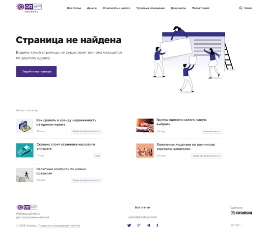
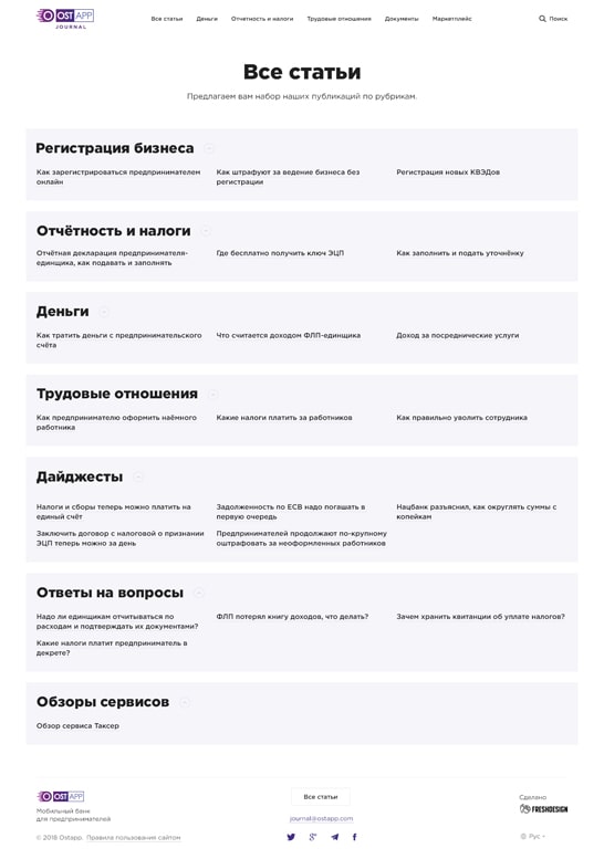
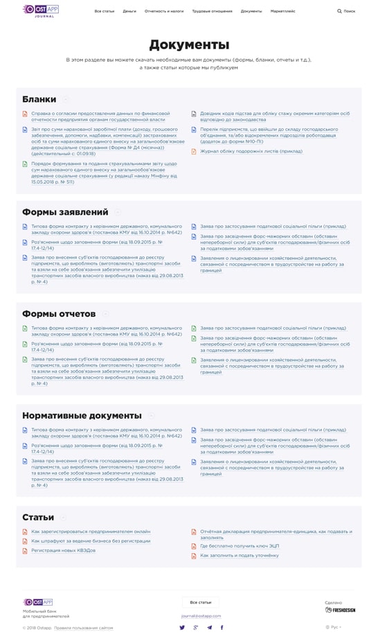
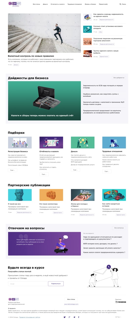
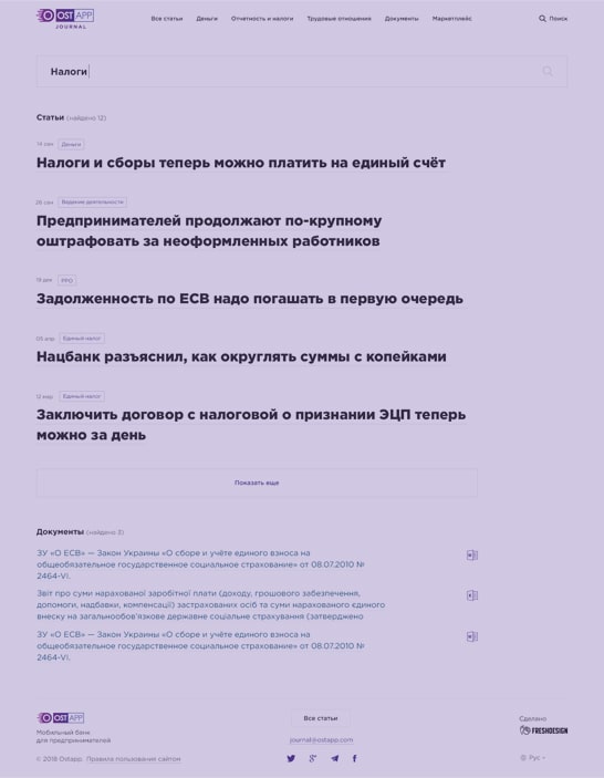
Having taken into the account the volume of the content that requires processing, we extended the features of the fdForge system and optimized it for the project