In 2013, emerald was announced the color of the year:
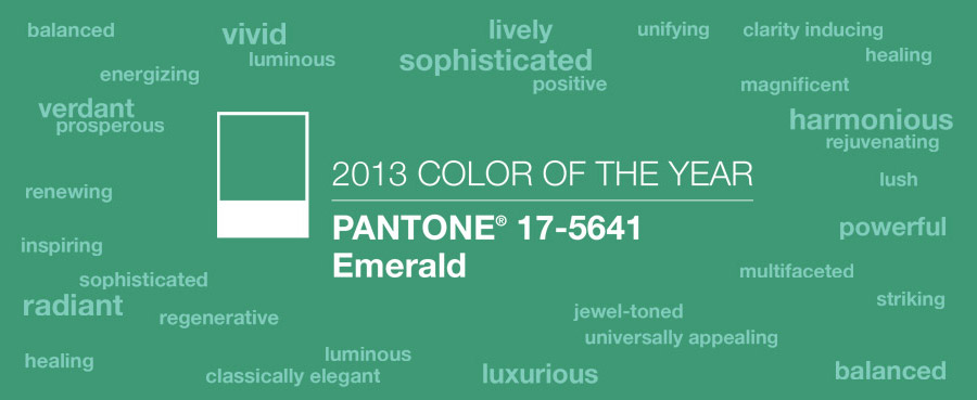
According to Pantone experts, emerald adds a touch of luxury, sophistication, and also promotes harmony and tranquility.
Emerald — warm and deep shade of green spectrum. This color is quite dark, so designers are advised to use it for emphasis.
Determination of color of the year is the result of the analysis of a variety of factors — global fashion trends, works of contemporary artists, recent blockbusters.
Pantone selects a color of the year for the past 10 years, and it usually they do it in the new year period, as forecast.
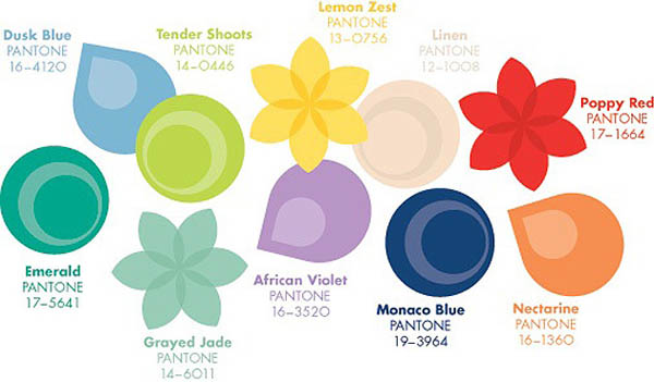
Of course , the definition of emerald green as the main , does not mean that everything should be exactly emerald. Pantone, together with leading European designers, developed a palette of colors that will go well together:
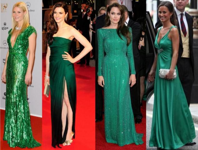
Of course, celebrities are following main fashion trends:
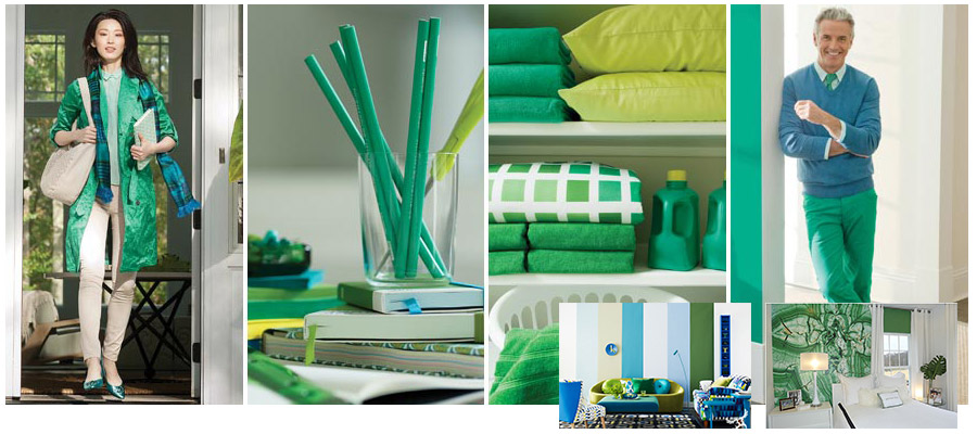
Emerald is actively used in interior decoration:
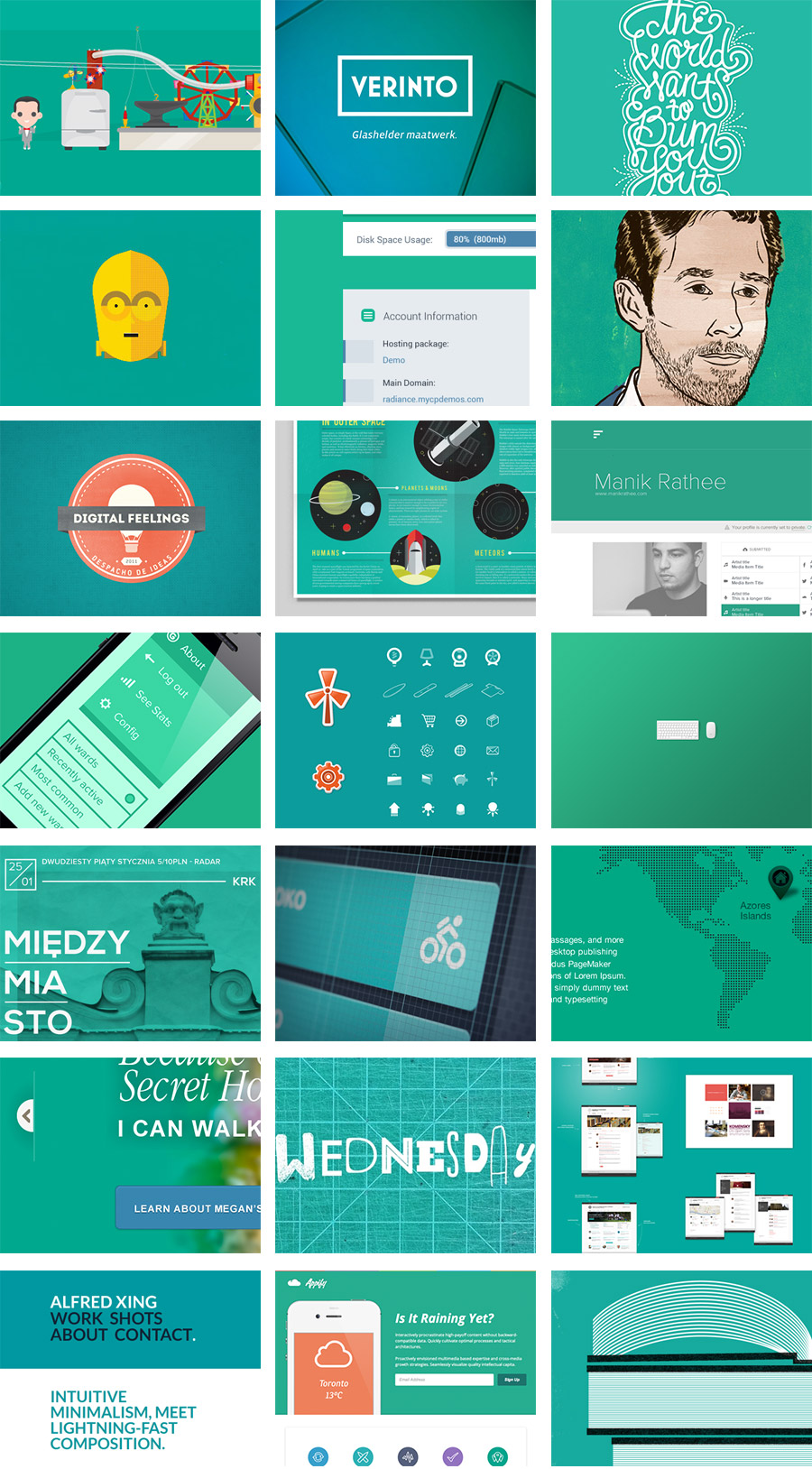
Well, back to our workfield — check out a few examples of Emerald sites. Emerald looks fresh enough in many web projects:
But do not forget — that by following trends, it is important not to lose your own individuality and personal style — the color of the year by Pantone might be a good, but only a recommendation.

